Introduction:
I just recently signed up for NetFlix to get my videos over by mail. My wife in particular pointed out to me how nice the descriptions are being shown in a pop-up. Thereafter, I noticed that they have done super cool
UIs all over their website. One of the things I got curious about was the way they showed descriptions of the movie by poping up a box with an arrow. The nice thing is that
the box has a transparent shadow/glow in the back. I wanted to impress my wife and show her that this can be done easily. This article will show you how to show a pop up
like the one mentioned above, both statically and dynamically by using the AJAX Control Kit's HoverPopUpMenu.
 The Fun Begins!
The trick here is really simple: It's all about the transparent images! You can create a better looking one just by changing the images from the code download below. You want your box
images to have a transparent background and created in png 32 format either in photoshop or fireworks, or your favorite graphic tool. With that said, let's move on to coding. The
demonstration shown above was done statically, and of course, if you could code one thing statically, you you also generate these objects dynamically, thanks to ASP.Net.
Creating a Static PopUp
1. Drag a ScriptManager onto a WebForm. Then drag a HyperLink ASP.Net server control onto a webform as shown below:
13 <asp:ScriptManager ID="ScriptManager1" runat="server" />
14
15 <!-- static example -->
16 <div style="float: left; width: 120px;">
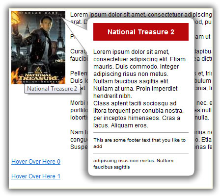
17 <asp:HyperLink ID="HlnkHyperlink1" Text="National Treasure 2" NavigateUrl="#" ImageUrl="~/Images/NationalTreasure2.jpg" runat="server" />
18 </div>
2. Then drag a HoverMenuExtender control next onto the webform. Reference the Hyperlink above using the TargetControlID attribute of the HoverMenuExtender control as shown below. The
OffsetX and OffsetY attributes tell us where to position the popup relative to the HyperLink. So if you want it to go closer to the left simply give the OffsetX and negative number, the
bigger the number the closer it shows to the hyperlink, or in our situation here, we are showing an image, so the bigger the negative number, the closer the arrow is to the image. As
you might have already guessed, giving the OffsetY attribute a positive value moves the popup up, and a negative value move it further down.
35 <cc1:HoverMenuExtender ID="HoverMenuExtender1" runat="Server"
36
TargetControlID="HlnkHyperlink1"
37 PopupControlID="PopupMenu"
38 PopupPosition="Right"
39 OffsetX="-100"
40 OffsetY="-6"
41 PopDelay="500" />
3. Create an ASP.Net Panel Server Control that will contain the style of your pop up window, as well as the information that you want to show your users. This is where you can get
creative, not just for the design of the pop-up, but as well as the kinds of information you can show your users. The code shown below is pretty self explanatory. See code below:
43 <asp:Panel CssClass="popUpArrowPanel" ID="PopupMenu" runat="server">
44 <table class="popUpArrowBoxTable">
45 <tr>
46 <td></td>
47 <td class="popUpArrowBoxTdTopLeft"></td>
48 <td class="popUpArrowBoxTdTopSide"></td>
49 <td class="popUpArrowBoxTdTopRight"></td>
50 </tr>
51 <tr>
52 <td class="popUpArrowBoxTdTopArrow"></td>
53 <td class="popUpArrowBoxTdSideLeft"></td>
54 <td class="popUpArrowBoxTdContent">
55 <div style="font-weight: bold; font-size: 14px; color: White; padding: 10px; background-color: #B9090B; text-align: center;">
56 National Treasure 2
57 </div>
58 <br />
59 Lorem ipsum dolor sit amet, consectetuer adipiscing elit. Etiam mauris. Duis commodo. Integer
60 adipiscing risus non metus. Nullam faucibus sagittis
61 elit. Nullam at urna. Proin imperdiet hendrerit nibh.
62 <br />
63 Class aptent taciti sociosqu ad litora torquent per conubia nostra, per inceptos
64 himenaeos. Cras a lacus. Aliquam eros.
65 <hr />
66 <div style="font-size: smaller;">
67 This are some footer text that you like to add
68 </div>
69 <hr />
70 <div style="font-size: smaller;">
71 adipiscing risus non metus. Nullam faucibus sagittis
72 </div>
73 </td>
74 <td class="popUpArrowBoxTdSideRight"></td>
75 </tr>
76 <tr>
77 <td></td>
78 <td class="popUpArrowBoxTdBottomLeft"></td>
79 <td class="popUpArrowBoxTdBottomSide"></td>
80 <td class="popUpArrowBoxTdBottomRight"></td>
81 </tr>
82 </table>
83 </asp:Panel>
4. The table shown above, inside the panel makes the style of the pop-up box. Shown below is the style classes for each one of the classes shown above. To change the size or width of the popup box, simply change the
width attribute of the
popUpArrowBoxTable as shown below:
7 .popUpArrowPanel {
8 display: none;
9 }
10
11 .popUpArrowBoxTable{
12
width:
380px;
13 padding: 0;
14 margin: 0;
15 border-collapse: collapse;
16 }
17
18 .popUpArrowBoxTdTopLeft {
19 width: 75px;
20 height: 28px;
21 background-image: url('../../Images/BoxTopLeft.png');
22 background-repeat: no-repeat;
23 }
24
25 .popUpArrowBoxTdTopSide {
26 background-image: url('../../Images/BoxSideTop.png');
27 background-repeat: repeat-x;
28 width: 160px;
29 }
30
31 .popUpArrowBoxTdTopRight {
32 width: 28px;
33 height: 28px;
34 background-image: url('../../Images/BoxTopRight.png');
35 background-repeat: no-repeat;
36 }
37
38 .popUpArrowBoxTdTopArrow {
39 vertical-align: top;
40 background-image: url('../../Images/BoxTopLeftArrow.png');
41 background-repeat: no-repeat;
42 position: relative;
43 left: 75px;
44 top: -28px;
45 height: 94px;
46 width:75px;
47 }
48
49 .popUpArrowBoxTdSideLeft {
50 vertical-align: top;
51 width: 75px;
52 height: 120px;
53 background-image: url('../../Images/BoxSideLeft.png');
54 background-repeat: repeat-y;
55 }
56
57 .popUpArrowBoxTdContent {
58 vertical-align: top;
59 background: url('../../Images/SpacerWhite.gif');
60 }
61
62 .popUpArrowBoxTdSideRight {
63 width: 28px;
64 height: 120px;
65 background-image: url('../../Images/BoxSideRight.png');
66 background-repeat: repeat-y;
67 }
68
69 .popUpArrowBoxTdBottomLeft {
70 width: 75px;
71 height: 28px;
72 background-image: url('../../Images/BoxBottomLeft.png');
73 background-repeat: no-repeat;
74 }
75
76 .popUpArrowBoxTdBottomSide {
77 background-image: url('../../Images/BoxSideBottom.png');
78 background-repeat: repeat-x;
79 width: 160px;
80 }
81
82 .popUpArrowBoxTdBottomRight {
83 width: 28px;
84 height: 28px;
85 background-image: url('../../Images/BoxBottomRight.png');
86 background-repeat: no-repeat;
87 }
Creating The Dynamic PopUp
1. In the world of ASP.Net, if you can generate objects statically, you can of course generate these objects dynamically as well. As far as NetFlix or Blockbuster is concerned, they are not creating
these popups one by one or statically, instead, they're getting the images, descriptions, titles, etc from a database. Whether they're retrieving these information from XML or MS SQL Server, these
information is shown dynamically, therefore, the pop-up is also generated dynamically.
Just to give you a very simple example of how to do this, I'm going to drag a PlaceHolder Server Control onto the WebForm. This PlaceHolder Server Control will serve as a container for the objects that we
used above (Creating a Static PopUp): the HyperLink, the HoverMenuExtender, and the Panel Server Control. The PlaceHolder Server Control is all we need to demonstrate how to generate the pop-ups dynamically.
85 <!-- dynamic example -->
86 <asp:PlaceHolder ID="PlhContent" runat="server" />
2. We will generate five (5) pop-up links inside a for loop. For loop is shown below: The first thing we will do is add the HyperLink Server Control Dynamically to the PlaceHolder object. Adding
the HyperLink Server Control is simple enough, shown in lines 16-19. You will also notice here that I added the code "hl.NavigateUrl = "#";" in line 19, this is to ensure that the links we generate
will be distinguished as a link (with a blue color and underline), else it will be just a regular black text.
The most important part of the code here is highlighted in line 20. This is where we add the HyperLink Server Control to the PlaceHolder object.
Note: Generating dynamic controls are normally done in the Page Init
method of the web form, but since we're just generating controls that does Not postback, doing it in the Page Load event is just fine.
13 for (int i = 0; i < 5; i++)
14 {
15 // add a hyperlink to the placeholder
16 HyperLink hl = new HyperLink();
17 hl.ID = "Hlnk" + i.ToString();
18 hl.Text = "Hover Over Here " + i.ToString();
19 hl.NavigateUrl = "#";
20
PlhContent.Controls.Add(hl);
21 PlhContent.Controls.Add(new LiteralControl("<br/><br/>"));
Now let's add the HoverMenuExtender component to the PlaceHolder Server Control. Again, I highlighted the part where we actually add this control to the PlaceHolder object. See code below:
23 // add a hovermenuextender
24 HoverMenuExtender hme = new HoverMenuExtender();
25 hme.TargetControlID = "Hlnk" + i.ToString();
26 hme.PopupControlID = "PnlPopUp" + i.ToString();
27 hme.PopupPosition = HoverMenuPopupPosition.Right;
28 hme.OffsetX = -100;
29 hme.OffsetY = -6;
30 hme.PopDelay = 0;
31
PlhContent.Controls.Add(hme);
Lastly, we will create a panel control dynamically. We will then build the string that will contain the style and text of the popup. You will notice that I used a StringBuilder object, then assigned the string
representation of that object to a Literal Server Control shown in line 79. The Literal Server Control is then added to the Panel object shown in line 84. And again, the Panel Server Control is added to
the PlaceHolder Server Control.
33 StringBuilder sb = new StringBuilder();
34 sb.Append("<table class='popUpArrowBoxTable'>");
35 sb.Append(" <tr>");
36 sb.Append(" <td></td>");
37 sb.Append(" <td class='popUpArrowBoxTdTopLeft'></td>");
38 sb.Append(" <td class='popUpArrowBoxTdTopSide'></td>");
39 sb.Append(" <td class='popUpArrowBoxTdTopRight'></td>");
40 sb.Append(" </tr>");
41 sb.Append(" <tr>");
42 sb.Append(" <td class='popUpArrowBoxTdTopArrow'></td>");
43 sb.Append(" <td class='popUpArrowBoxTdSideLeft'></td>");
44 sb.Append(" <td class='popUpArrowBoxTdContent'>");
45
46 // content
47 sb.Append(" <div style='font-weight: bold; font-size: 14px; color: White; padding: 10px; background-color: #B9090B; text-align: center;'>");
48 sb.Append(" This is a Title Here");
49 sb.Append(" </div>");
50 sb.Append(" <br />");
51 sb.Append(" Lorem ipsum dolor sit amet, consectetuer adipiscing elit. Etiam mauris. Duis commodo. Integer ");
52 sb.Append(" adipiscing risus non metus. Nullam faucibus sagittis ");
53 sb.Append(" elit. Nullam at urna. Proin imperdiet hendrerit nibh.");
54 sb.Append(" <br />");
55 sb.Append(" Class aptent taciti sociosqu ad litora torquent per conubia nostra, per inceptos ");
56 sb.Append(" himenaeos. Cras a lacus. Aliquam eros.");
57 sb.Append(" <hr />");
58 sb.Append(" <div style='font-size: smaller;'>");
59 sb.Append(" This are some footer text that you like to add");
60 sb.Append(" </div>");
61 sb.Append(" <hr />");
62 sb.Append(" <div style='font-size: smaller;'>");
63 sb.Append(" adipiscing risus non metus. Nullam faucibus sagittis");
64 sb.Append(" </div>");
65 // end of content
66
67 sb.Append(" </td>");
68 sb.Append(" <td class='popUpArrowBoxTdSideRight'></td>");
69 sb.Append(" </tr>");
70 sb.Append(" <tr>");
71 sb.Append(" <td></td>");
72 sb.Append(" <td class='popUpArrowBoxTdBottomLeft'></td>");
73 sb.Append(" <td class='popUpArrowBoxTdBottomSide'></td>");
74 sb.Append(" <td class='popUpArrowBoxTdBottomRight'></td>");
75 sb.Append(" </tr>");
76 sb.Append("</table>");
77
78 Literal lit = new Literal();
79
lit.Text = sb.ToString();
80
81 // add the popup panel
82 Panel pnl = new Panel();
83 pnl.ID = "PnlPopUp" + i.ToString();
84
pnl.Controls.Add(lit);
85 pnl.CssClass = "popUpArrowPanel";
86
87
PlhContent.Controls.Add(pnl);
Note: We didn't realy need to create a StringBuilder object and the Literal Server Control, instead, we could have just added the style and text information directly to the Panel Server Control as
LiteralControl objects as shown below:
pnl.Controls.Add(new LiteralControl("<table class='popUpArrowBoxTable'>"));
pnl.Controls.Add(new LiteralControl(" <tr>"));
.
.
.
pnl.Controls.Add(new LiteralControl("</table>"));
PlhContent.Controls.Add(pnl);
Last Words:
Now that you know how to create a NetFlix/Blockbuster style pop-up dynamically, you can now be more creative and change the images that came from the code download below. It took less than 30 minutes
to do the code, but the design of the box took me a lot longer since I'm really not a graphic person.
As always, the code and the article are provided "As Is", there is absolutely no warranties. Use at your own risk.